Using R Markdown & knitr
05 Oct 2017In the previous two posts, there were several plots and I indicated that I used R to scrape html tables from the Bureau of Labor Statistics website. This post provides a quick tutorial on how I obtained and plotted the data using R (& various packages).
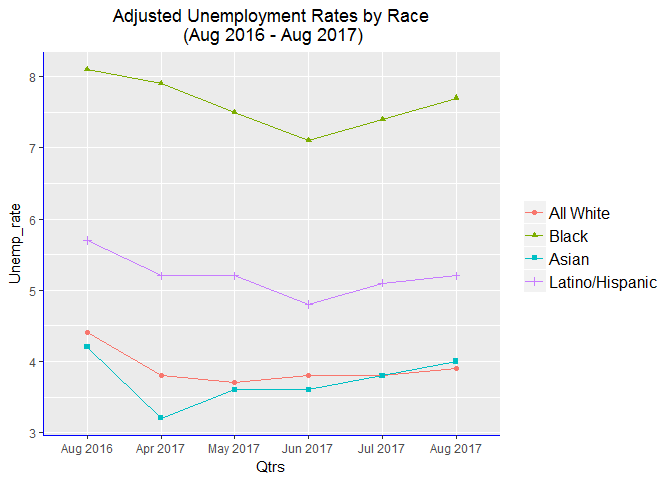
I will first setup the R environment and load some of the packages that will be used. The good thing in using R Markdown is creating code in chunks for clarity and ease of debugging. Table 2 & Table 3 of the Economic News Release contain the relevant general labor force data including employment/unemployment rates for various groups. Note that Monthly data change in those tables. At the time of this writing, the tables had data for Aug 2016 - Aug 2017 period. I extracted and plotted unemployment rate data by race/ethnicity and by gender.
Code chunks in R Markdown begin & end with ```
{r setup, include=FALSE}
knitr::opts_chunk$set(echo=TRUE, invisible=TRUE, warning=FALSE)

#load libraries
pkg<-c("XML", "RCurl", "rlist", "curl", "stringr", "gapminder",
	"ggplot2", "xml2", "dplyr", "zoo", "readxl")

lapply(pkg, require, character.only = TRUE)
-
Obtain (scrape) & parse the relevant html tables:
#This code will extract the data.
EconNews <- as.data.frame(readHTMLTable(
	getURL("https://www.bls.gov/news.release/empsit.t02.htm"),
        stringsAsFactors=FALSE, trim = TRUE))

#see what the first few lines of the data look like. We also need to assign appropriate columns and rows later.
head(EconNews[,c(1,5:10)])

#looking at the first few rows of first column & columns 5-10. columns 2-4 are unadjusted data.
Some more data cleaning & adjustment: remove “,” from the data so we can conveniently convert from one to another form of data types.
EconNews[] <- lapply(EconNews, gsub, pattern=',', replacement='')

#Make columns for the table and assign those to columns 2-10 (the first column is variable names)

colName <- c("Aug2016", "Jul2017", "Aug2017", "Aug2016a", "Apr2017a",
		  "May2017a", "Jun2017a", "Jul2017a", "Aug2017a")

#the suffix 'a' indicates that column's data is seasonally adjusted.
names(EconNews)[2:10] <- colName
- Scraping the data for Latino/Hispanic group
Essentially, the code for this is the same as above but need to point to the appropriate url & name the data frame.
EconNewsLat <- as.data.frame(readHTMLTable(
	getURL("https://www.bls.gov/news.release/empsit.t03.htm"),
	stringsAsFactors=FALSE, trim = TRUE))

EconNewsLat[]<-lapply(EconNewsLat, gsub, pattern=',', replacement='')

names(EconNewsLat)[2:10] <- colName
Names of the first column & first row of “EconNews” & “EcoNewsLat” are different, since we can’t bind rows when column names are different, rename them with the same column name or drop the names. I will remove them (really assigning a blank).
colnames(EconNewsLat)[1] <- ""
colnames(EconNews)[1] <- ""
Use dplyr’s bind_rows function to append the two tables & call the giant table “EconNewsAll”
EconNewsAll <- dplyr::bind_rows(EconNews,EconNewsLat)

#Have a look at the first few lines of the relevant columns.
head(EconNewsAll[,c(1,5:10)])
Now I can subset data by race, gender and age. I also need to rename the rows.
- Subset data for the White group
#grab sub-table for all White group as "W1data"
W1data <- EconNewsAll[2:9,2:10]

#Rename rows
rownames(W1data)<- c("Civil_noninst_pop","civil_labor_force",
		"Particip_rate", "Employed", "Emp_pop_ratio",
		"Unemployed","Unemp_rate", "Not_in_labor_force")

#transpose table for analysis & plotting
W1data <- as.data.frame(t(W1data))
Add indicator variables for ‘Race’, ‘Qtrs’ which is really ‘month’, & ‘Class’. The new class variable indicates age & gender in case we want to look at plots by age, gender and race…
#again with the dplyr package
W1data <- W1data %>%
    mutate(Qtrs = as.numeric(c(seq(1:9))),
           Race = as.factor(c(rep(1,9))),
           Class = as.factor(c(rep(1,9))))

#convert variables to numeric
W1data[,1:8] <- lapply(W1data[,1:8],
			function(x) as.numeric(as.character(x)))
All other data manipulation activities for the other race/ethnic groups similar to the one for the White group above, so I will not elaborate further. Just remember to change data frame names, select/assign appropriate rows & classes.
I have obtained sub-tables for Black/African American as ‘B1data’, for Hispanic/Latino as ‘L1data’, & for Asian as ‘A1data’. So, I will combine (append) the four tables with the following code to obtain one table for all race/ethnic groups:
WBAL1data <- dplyr:: bind_rows(W1data, B1data, A1data, L1data)

WBAL1data[,10:11] <- lapply(WBAL1data[,10:11],
			function(x) as.factor(as.character(x)))
Time to plot the data!
#Plot for Race/ethnic groups using ggplot
#Note I am plotting subset of data as indicated by the selected rows below
All_plot <- ggplot(data=WBAL1data[c(4:9,13:18,22:27,31:36),],
    aes(x=Qtrs, y=Unemp_rate, shape=Race, color=Race, group=Race ))+
  geom_point() +
  geom_line() +
  scale_x_discrete(limits =c(4:9),
	labels=c("Aug 2016", "Apr 2017", "May 2017", "Jun 2017",
					"Jul 2017", "Aug 2017"))+

  scale_color_discrete(breaks=c(1:4),
	labels=c("All White", "Black", "Asian", "Latino/Hispanic")) +

  scale_shape_discrete(breaks=c(1:4),
	labels=c("All White", "Black", "Asian", "Latino/Hispanic")) +

  theme(axis.line = element_line(color="blue", linetype = "solid"),
			   plot.title = element_text(hjust = .5)) +

  ggtitle("Adjusted Unemployment Rates by Race\n
					(Aug 2016 - Aug 2017)") +

  theme(legend.title = element_blank(),
		legend.text = element_text(size = 12),
		legend.background = element_rect(fill="NA",
				size=.5, linetype = "solid"))
#reveal the plot
All_plot

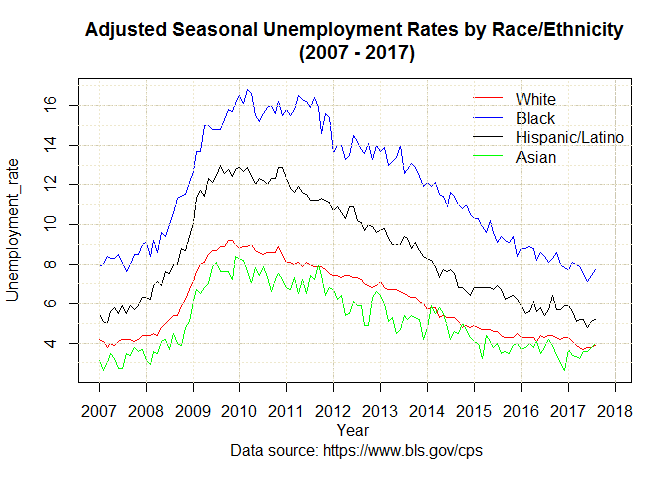
The above plot was for 6 time points within a year, now I will look at 10 years’ monthly data.
Time Series Data
A Time Series data of Unemployment Rates by Race/ethnicity (2007 - 2017) are available in excel format for various groups in the BLS website here. I saved each of the seasonally adjusted unemployment rates data files in my local drive. Next, I imported the datasets in R, processed and plotted as below.
- Time series data for the White group
WhiteAll_unemp <- as.data.frame(
	read_excel("yourPath/fileName.xlsx", skip=12))
#'skip' first 12 rows because they are notes

#I will assign original data frame to a new data frame & drop the first column
WhiteAll_unempl <- WhiteAll_unemp[,-1]

# (re-assign) make the first column from the previous dataset to be row names like:
rownames(WhiteAll_unempl) <- WhiteAll_unemp[,1]

#create & convert to time series.
#You will appreciate this step if you look at the data before and after the following code is executed.

WhiteAll_unemp2 <- ts(as.vector(t(as.matrix(WhiteAll_unempl))),
		start = c(2007, 1), end=c(2017, 12), frequency=12)
The above four lines of code are applied to the tables for Black, Hispanic & Asian groups below (just specify appropriate path/fileName & change data frame names).
- Time series data for the Black/African American group
BlackAll_unemp <- as.data.frame(
	read_excel("yourPath/fileName.xlsx", skip=12))

BlackAll_unempl <- BlackAll_unemp[,-1]

rownames(BlackAll_unempl) <- BlackAll_unemp[,1]

BlackAll_unemp2 <- ts(as.vector(t(as.matrix(BlackAll_unempl))),
           start = c(2007, 1), end=c(2017, 12), frequency=12)
- Time series data for the Hispanic/Latino group
HispanicAll_unemp<-as.data.frame(
		read_excel("yourPath/fileName.xlsx", skip=12))

HispanicAll_unempl <- HispanicAll_unemp[,-1]

rownames(HispanicAll_unempl) <- HispanicAll_unemp[,1]

HispanicAll_unemp2 <- ts(as.vector(t(as.matrix(HispanicAll_unempl))),
            start = c(2007, 1), end=c(2017, 12), frequency=12)
- Time series data for the Asian group
AsianAll_unemp<-as.data.frame(
		read_excel("yourPath/fileName.xlsx", skip=12))

AsianAll_unempl <- AsianAll_unemp[,-1]

rownames(AsianAll_unempl) <- AsianAll_unemp[,1]

AsianAll_unemp2 <- ts(as.vector(t(as.matrix(AsianAll_unempl))),
		start = c(2007, 1), end=c(2017, 12), frequency=12)
Plotting using R-package zoo…
#Use the zoo library for simple quick plot.
#data are in long form, so column bind the 4 data frames.

plot.zoo(cbind(WhiteAll_unemp2, BlackAll_unemp2,
	HispanicAll_unemp2, AsianAll_unemp2),
	plot.type = "single", xy.labels = TRUE,
	xlab="Year \n Data source: https://www.bls.gov/cps",
	ylab = "Unemployment_rate",
	col = c("red", "blue", "black", "green"),
	main = "Adjusted Seasonal Unemployment Rates by
		Race/Ethnicity\n (2007 - 2017)")

legend("topright", inset = c(0,0), y.intersp = 1,
	legend = c("White", "Black", "Hispanic/Latino", "Asian"),
	lty=1, bty = "n", col = c("red", "blue", "black", "green"),
	axis(1, 2007:2017), cex = 1)

grid (NULL,NULL, lty = 6, col = "cornsilk3")
abline(h=3:17, v=2007:2017, col="cornsilk2", lty=3)

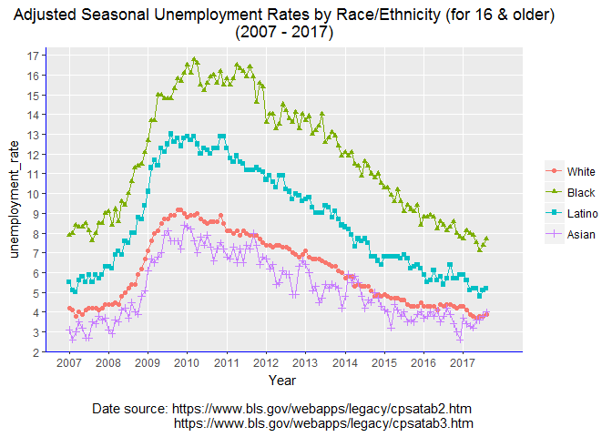
Alternatively, we can use ggplot, but first we need few more steps to prepare the data.
#prepare data in a format ggplot2 likes
ts_All_race <- (cbind(WhiteAll_unemp2, BlackAll_unemp2,
			HispanicAll_unemp2, AsianAll_unemp2))

df_all_race <- fortify.zoo(ts_All_race, melt=TRUE,
			yearmon_trans(format="%b%Y", n=12))

df_all_race <- rename(df_all_race, Year=Index,
			unemployment_rate=Value, Race=Series)
Plot the time series (one can reduce some of the specifications below)
ggplot(data=df_all_race, aes(x=Year, y=unemployment_rate,
		group=Race, shape=Race, color=Race)) +

geom_line() +
geom_point() +
scale_x_discrete(limit=c(2007:2017)) +
scale_y_discrete(limits=c(2:17)) +

scale_color_discrete(breaks=c("WhiteAll_unemp2", "BlackAll_unemp2",
		"HispanicAll_unemp2", "AsianAll_unemp2"),
		labels=c("White", "Black", "Latino", "Asian")) +

scale_shape_discrete(breaks=c("WhiteAll_unemp2", "BlackAll_unemp2",
		"HispanicAll_unemp2", "AsianAll_unemp2"),
		labels=c("White", "Black", "Latino", "Asian")) +

ggtitle("Adjusted Seasonal Unemployment Rates by Race/Ethnicity
		(for 16 & older)\n(2007 - 2017)") +

xlab("Year \n Date source:
		https://www.bls.gov/webapps/legacy/cpsatab2.htm
		https://www.bls.gov/webapps/legacy/cpsatab3.htm") +

theme(axis.line = element_line(color="blue", linetype = "solid"),
			plot.title = element_text(hjust = .5),
			legend.title = element_blank())

End.