Child Mortality Rates by Race (US)
05 Nov 2017What drives disparities in health outcomes? Research supports the notion that socioeconomic status (SES) has a significant impact on health outcomes. The best (experimental/observational) studies on the effects of social structural differences and positions of individuals within these structures oh health are from animal studies. Overall, these studies say social hierarchy is bad for health (especially for those ranking lower but sometimes for those who rank higher when the stability of their status is uncertain). See work by Jay Kaplan and Robert Sapolsky among others. Such experimental studies, of course, cannot be carried out on humans. Longitudinal data, however, are beginning to be used to make some inference about the whys and hows of the effects of social hierarchy on human health.
I have two objectives in this post: to plot & explore child mortality rates at a granular level, and to explain how to use R to work on multiple files in a local directory.
Linked birth-death data can be obtained from CDC’s WONDER services site here. Agree to the terms and specify the type of data you want, then export/save results as a text file in your local drive. I requested datasets for 8 years (2007-2014) and saved the datasets in my local drive. see example of a dataset for 2007 here
Set working directory as the root directory (where datasets are saved) in knitr and include the relevant packages to be loaded as follows:
{r setup, include=FALSE}
knitr::opts_chunk$set(echo = TRUE, warning = FALSE, invisible=TRUE)
knitr::opts_knit$set(root.dir = 'Path/ChildMortality')
getwd()

pkg <- c("rlist", "stringr", "ggplot2", "dplyr",
         "tidyr", "reshape", "reshape2")
lapply(pkg, require, character.only = TRUE)
However there are some shortcomings with the datasets I have requested and for a general exposition of differences in death rates, I ignored these shortcomings. For instance there are several cells marked ‘Unreliable’ because of low numbers in those categories. Not all states have data for all race/ethnic groups due to either low numbers of race/ethnic groups in those states or failure to collect data. Because another major reason for this post was to show how to use R to work with several datasets, I feel it is safe to overlook the weaknesses of the datasets.
Let’s create a list to contain the eight datasets:
#Make a list that contains your datasets & provide the right path
#You can use getwd() or provide complete path
mortalityData_list <- list.files(path=getwd(), pattern="*.txt",
                       full.names = TRUE)
The lapply, sapply, tapply… family of functions are very handy in performing the same thing to lists, vectors, variables or datasets etc.
In our case, datasets are .txt files and tab delimited, we will use lapply on the “mortalityData_list” created to read in each of them. The ‘datalist’ object below will contain those datasets as a list. Notice we specify “read.delim”.
datalist <- lapply(mortalityData_list, read.delim)
You can do typeof(datalist) to confirm that.
Data Cleaning
The “Death.Rate” column in those datasets has “(Unreliable)” in some of the cells and we need to remove it. So the code below
replaces “(Unreliable)” with nothing. Include fixed=TRUE so ‘(‘ & ‘)’ are removed too.
mortalityData <- lapply(datalist, function(i)
   transform(i, Death.Rate = gsub("(Unreliable)", "",
                                  fixed = TRUE, Death.Rate)))

#Let's drop the first columns from the datasets because they are notes.
mortalityData <- lapply(mortalityData, function(x) x[, -1])

#After dropping the first column, I noticed that there are several rows with 'NA'
# after the last row of the data in each table, so we have to remove "NA" as follows.

mortalityData <- lapply(mortalityData, function(y) y[rowSums(is.na(y)) == 0, ])

#I can transform some of the columns to factor or numeric ...
mortalityData <- lapply(mortalityData, transform, Death.Rate=as.numeric(Death.Rate),
                  State=as.factor(State), Race=as.factor(Race),
                State.Code=as.factor(State.Code))
We need to include a time variable in each of the 8 datasets. So, we create a list of ‘years’ & populate a column with specific year for each dataset.
years <- list(2007, 2008, 2009, 2010, 2011, 2012, 2013, 2014)

#Add year indicator to each data frame in the list as follows
for( i in seq_along(mortalityData)){
  mortalityData[[i]]$year <- rep(years[i], nrow(mortalityData[[i]]))
}
Combine data frames to one long form if you like but one can also operate on each of the datasets without row-binding.
#rename and row-bind as follows
mortalityData_long <- as.data.frame(do.call("rbind", mortalityData))

#I just realized that the "year" variable I added above
#is a list and ggplot doesn't know what to do with it. So change it using "unnest" function from tidyr package

mortalityData_long <- unnest(mortalityData_long, year)

mortalityData_long[,3] <- as.factor(mortalityData_long$Race)
mortalityData_long[,8] <- as.factor(mortalityData_long$year) #Just so all the years appear on the horizontal axis
Plots
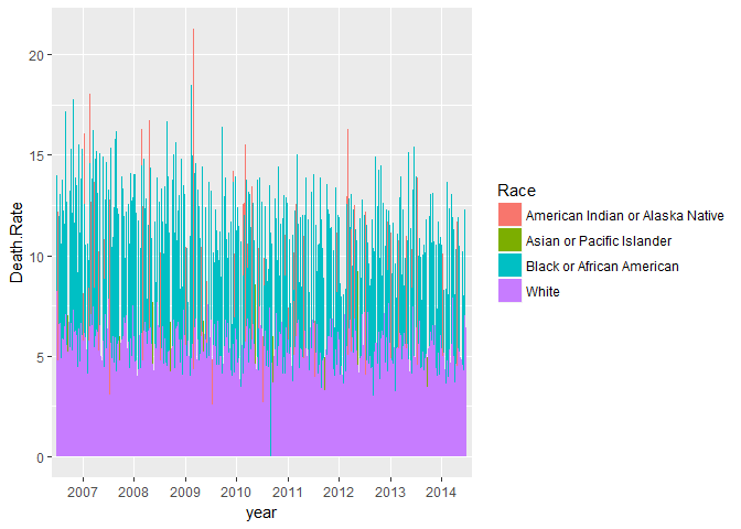
First, let’s just plot that data as it is for each year. This only gives a general idea of the trends across states and years by race. Where data are available, it looks like minorities (other than Hispanic/Latino who identify as White) experience higher death rates. I should note here that in several states data for American Indian/Alaska Native and Asian/Pacific Islander are not available. Where they are available, it appears that American Indian/Alaska Natives have higher mortality rates.
#Plots

childMortality_plot1 <- ggplot(data=mortalityData_long,
                     aes(x=year , y=Death.Rate, group=State,
                         fill=Race, na.rm=TRUE)) +
  geom_bar(stat="identity", width = 1, position=position_dodge())

#Reveal plot
childMortality_plot1

But we can look at the data nationally. To do that, we quickly compute new variables as follows:
Let’s create 3 variables on the fly and use them in ggplot-ing. These steps will render the “State” variable useless.
(rates by race & by year nationally is what I’m after).
#using the 'pipe' %>% operator
mortalityData_long <- mortalityData_long %>% group_by(year, Race) %>%
  mutate(tot_Deaths = sum(Deaths), tot_Births=sum(Births),
         Child_Mortality_Rates=(round(tot_Deaths/tot_Births*1000, 1)))
I just created total births and deaths for each state, then used these to compute death rates. This is a very rough, high-level view of national trends. Remember that data for all races in all the states are not available. The White group is missing data only for 2011 for the District of Columbia (if you look closely at the plot above, you will see one line (for Blacks) going all the way down –there is no data for Whites in that year in D.C.)
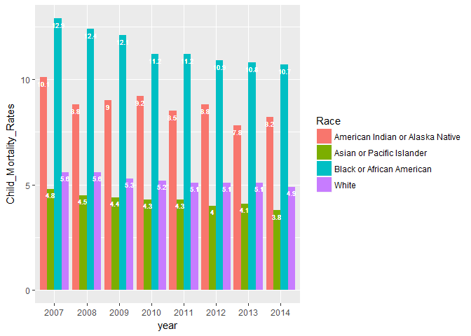
Now we have what we need to plot an approximate estimate of national child mortality rates by race and by year.
#New Plot (childMortality_plot2)
childMortality_plot2 <- ggplot(data=mortalityData_long,
                     aes(x=year , y=Child_Mortality_Rates, group=Race,
                         fill=Race, na.rm=TRUE)) +
  geom_bar(stat='identity', position=position_dodge()) +
geom_text(aes(label=Child_Mortality_Rates), vjust=1.6, color='white',
          position=position_dodge(0.9), size=2.5)

#Reveal new plot
childMortality_plot2

The new plot clearly shows higher child mortality rates for American Indian/Alaska Natives & Black/African Americans. Asian/Pacific Islanders have the lowest mortality rates. Mortality rates for Caucasian Whites are probably higher than mortality rates for Hispanics/Latinos. The bars for the White group include Hispanic/Latino ethnicity that identify as White and there are some indications that child mortality rates are lower for Hispanics/Latinos.